Color psychology in branding is all about making deliberate color choices to shape how people see, feel, and connect with your company. It’s a powerful tool that makes a first impression and telegraphs your brand’s values before a customer ever reads a single word. This turns what feels like a subjective creative choice into a calculated business decision.
What Is Color Psychology and Why Does It Matter?
Let's be honest, picking brand colors can feel like a purely artistic task. But what if it's actually one of the most strategic moves you can make? Color is your brand's silent ambassador, a non-verbal language that speaks directly to our subconscious.
Our minds are wired to connect certain colors with specific emotions, ideas, and values. This happens almost instantly and has a profound effect on perception. Think of your brand’s color palette as its emotional uniform—it sets the tone for every interaction and tells people whether you’re trustworthy, exciting, luxurious, or budget-friendly.
The Business Case for Strategic Color
Getting color right isn't just a job for designers; it's a core business strategy. The right colors can forge a memorable brand that resonates with your audience on a deep, instinctual level. This influences everything from initial trust to the final decision to buy. Before we dive into the psychology, getting a solid grip on understanding fundamental color theory provides an essential foundation.
The impact of color isn't just anecdotal—it’s backed by some pretty compelling numbers. Your color choice directly affects how memorable your brand is. For instance, research shows that a signature color can boost brand recognition by a massive 80%. This is huge, especially when you consider that 93% of consumers say visual appearance is the key factor in their purchasing decisions, with color being the most important part of that judgment.
Color is a powerful tool because it operates below the surface of conscious thought. It doesn't ask for permission to influence us; it just does. A well-chosen color can immediately establish the core feeling of a brand, creating a shortcut to emotional connection and recall.
Quick tip
Want to save 10+ hours a week on content?
Outbrand uses AI to generate a full month of on-brand social media posts in minutes. Join 1,000+ marketers who've already made the switch.
Ultimately, color psychology in branding is about creating a deliberate and consistent experience. When a brand’s colors perfectly match its message and personality, it creates a powerful synergy.
This alignment helps you:
Establish Instant Recognition: Think of the iconic red of Coca-Cola or the distinctive blue of Tiffany & Co. You can't separate the color from the brand.
Communicate Core Values: A brand using earthy green tones instantly signals a commitment to nature and sustainability. One using deep purple suggests luxury and sophistication.
Influence Consumer Actions: Using color strategically on your website, in call-to-action buttons, and on packaging can guide a user's attention and nudge them toward specific behaviors.
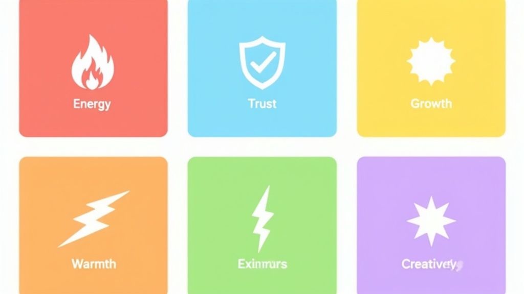
Quick Guide to Color Meanings in Branding
To help you get started, here's a quick look at some common colors used in branding and the feelings they typically evoke. Think of this as a cheat sheet for translating your brand's personality into a visual language.
Keep in mind that these associations aren't universal—cultural context and personal experiences play a big role. However, this table provides a solid starting point for making more informed and strategic color decisions for your brand.
Exploring the Emotional Spectrum of Brand Colors
It’s tempting to boil color psychology down to simple, one-word associations. We’ve all heard them: red means passion, blue means trust. And while those aren't wrong, they're just the starting point. The real magic happens when you understand that every color has a complex emotional language, with subtle nuances that can completely alter its message.
Think of each color as having a dual personality. Every hue carries a whole spectrum of potential meanings, and what it ultimately communicates depends on the context, the colors it’s paired with, and even the cultural background of the person seeing it. Getting this right is what separates decent branding from a visual identity that truly connects.
Let's move past the basics and unpack the rich, and sometimes contradictory, emotional messages that the core brand colors can send. When you grasp these nuances, you can choose colors that speak with precision and avoid sending the wrong signal.
The Duality of Red: Excitement and Urgency
Red is arguably the most emotionally charged color on the spectrum. On one hand, it’s the color of love, passion, and raw excitement. This is the side of red that brands use to drum up a feeling of energy and pure exhilaration.
Look at Coca-Cola. That iconic red isn’t just a color; it’s the feeling of timeless joy and good times. In the same way, Netflix uses red to signal entertainment and the thrill of diving into a new show. This red is warm, alive, and inviting.
But red has another, more demanding side. It's the universal sign for urgency, danger, and "pay attention now!" Think of stop signs, emergency alerts, or the bright red tags on a clearance rack. This is the aspect of red that grabs your attention and pushes you to act. In fact, one study found that simply changing a call-to-action button to red can significantly increase conversions by creating a powerful sense of immediacy.
The Balance of Blue: Trust and Aloofness
Blue is a giant in the corporate world, and for good reason. It’s overwhelmingly linked to trust, stability, and competence. It has a naturally calming effect on us, suggesting dependability and security.
This makes it the perfect choice for industries where trust is everything:
Finance: Brands like PayPal and American Express use blue to give users peace of mind that their finances are in safe hands.
Technology: Companies from Meta and IBM to Dell use blue to project intelligence and reliability.
Healthcare: Here, blue helps create a feeling of calm, sterility, and professional authority.
However, blue also has a cooler, more distant personality. If it's used poorly or in the wrong shade, it can come across as cold, impersonal, or even unwelcoming. Relying too heavily on stark, corporate blues without some warmer accent colors can make a brand feel unapproachable. The secret is finding the right balance—a shade that feels authoritative without being aloof.
The Green Paradox: Nature and Wealth
Green is a color of fascinating contradiction, representing two powerful concepts that can feel worlds apart: the natural world and financial prosperity. Its most primal connection is with nature, growth, health, and new beginnings.
Brands in wellness, organic food, and eco-conscious industries lean on green to signal their connection to the earth. When you see the green in the Whole Foods Market logo, you instantly think of fresh, natural products.
Green speaks a language of renewal and vitality. For eco-conscious brands, it’s a non-negotiable symbol of their values. For financial institutions, it’s a promise of growth and prosperity.
At the same time, green is the color of money, ambition, and wealth. Financial firms like Fidelity and NerdWallet use shades of green to build confidence that they can grow their clients' assets. This dual meaning makes green incredibly versatile, fitting in just as well at a local farmer's market as it does at a high-powered investment firm.
The Cultural Context of Color
Here’s where things get really interesting. A color’s meaning isn’t universal; it can shift dramatically from one culture to another. For global brands, navigating these differences is non-negotiable. What works beautifully in one market could be a complete misstep in another.
Take the color white. In most Western cultures, it symbolizes purity, minimalism, and weddings. But in many parts of Asia, white is the traditional color of mourning and funerals—a total reversal of meaning.
This table gives you a quick glimpse of how much meanings can vary:
Color
Western Meaning
Eastern/Other Meaning
Red
Love, Passion, Urgency
Luck, Prosperity, Joy (China); Mourning (South Africa)
Yellow
Happiness, Optimism
Courage, Royalty (Japan); Mourning (Egypt)
Blue
Trust, Calm, Authority
Immortality, Spirituality (Hinduism)
White
Purity, Simplicity
Mourning, Funerals (Many Asian Cultures)
This is precisely why deep audience research is a must, not a "nice-to-have." Overlooking cultural nuances is one of the easiest ways to alienate an entire market. A globally-aware color palette ensures your brand’s message lands exactly as you intended, no matter where in the world your customers are.
How Colors Influence Customer Perception and Behavior
The link between color and emotion isn't just a theory; it directly shapes how customers see your brand and what actions they take. Colors are powerful visual cues that work on a subconscious level, guiding opinions and decisions long before our conscious minds catch up. This is where color psychology stops being an abstract idea and becomes a real tool for growing your business.
Think about it: your brand's color palette is often the very first thing a potential customer notices. It sets the stage for their entire experience, framing how they feel about your product’s quality, value, and even trustworthiness. A simple color choice can be the difference between a user feeling confident and secure or feeling rushed and uncertain.
The Science of Snap Judgments
First impressions are formed in a flash, and color is the main ingredient in these instant evaluations. The psychological impact is stunning. Studies show that people make a subconscious judgment about a product within 90 seconds of first seeing it. And what’s truly incredible? Up to 90% of that snap judgment is based on color alone.
That means your color choices are doing most of the work in those first critical moments. The right palette can instantly communicate your brand's core message, while the wrong one can create a disconnect that’s incredibly hard to fix.
A customer's initial interaction with your brand is a silent conversation, and color is the language being spoken. It can build immediate trust, create a sense of urgency, or signal premium quality—all without a single word being exchanged.
From Perception to Action
This influence goes beyond just first impressions—it directly affects customer behavior. By strategically using color in your website design, ads, and packaging, you can guide a user's attention and encourage them to take specific actions. This is a crucial part of boosting conversion rates. The colors you pick for your call-to-action (CTA) buttons are a perfect example.
A vibrant, contrasting color makes a button pop, drawing the eye and practically begging for a click. This isn’t just about making things look nice; it’s about creating a clear visual roadmap that tells users exactly what to do next.
Guiding Attention: Bright, warm colors like red and orange are fantastic for pulling focus to key elements like "Buy Now" or "Sign Up" buttons.
Building Trust: Cool colors like blue and green often show up on checkout pages or login forms to create a feeling of security and calm.
Creating Exclusivity: Dark, rich colors like black or deep purple can elevate the perceived value of a product, making it feel more luxurious and high-end.
Color as a Storytelling Tool
Ultimately, the colors you choose become a core part of your brand’s story. They are a foundational piece of your visual identity, helping you tell that story consistently everywhere. A cohesive color strategy ensures that whether a customer sees your logo on social media, visits your website, or unboxes your product, they receive the same clear, intentional message.
This consistency builds brand loyalty over time. When customers can instantly recognize your brand just by its colors, it creates a powerful sense of familiarity and reliability. To learn more about how visual elements shape what an audience feels and thinks, it's worth exploring the psychology behind visual storytelling. By mastering how colors influence perception, you can turn your brand’s visual identity into a powerful asset that shapes how customers think, feel, and—most importantly—act.
Building Your Brand Identity with a Color Palette
It's one thing to understand what red or blue means, but it's a completely different challenge to combine colors into a system that truly represents your brand. This is where the theory gets real, and you start making choices that will define how people see you. Creating a brand color palette isn't about just picking shades you like; it’s a strategic process for building a visual language that speaks for you at every single customer touchpoint.
A thoughtfully constructed palette is your secret weapon for consistency. It strengthens brand recall and instantly communicates your personality. It also gives designers and marketers a clear roadmap, ensuring everything from your logo to your latest social post feels intentional and unified.
Start with Your Brand’s Personality
Before you even glance at a color wheel, you need to get crystal clear on your brand’s personality. Who are you? Are you playful and bursting with energy, or are you more serious and authoritative? Modern and sleek, or traditional and luxurious?
Try this: write down three to five adjectives that perfectly capture the brand you want to build. These words become your North Star. For instance, a brand aiming to be innovative, friendly, and bold will naturally lean toward a very different set of colors than one focused on being trustworthy, calm, and professional.
Research and Competitor Analysis
With your brand personality defined, it’s time to look outside your own walls. You have to understand the color landscape of your industry and, just as importantly, how your target audience feels about certain colors.
Audience Research: Never assume you know what your audience thinks. Simple surveys or focus groups can uncover powerful insights into their color associations and what they respond to.
Competitor Analysis: Take a hard look at your main competitors. What colors do they use? What feelings are they trying to spark? The goal here isn't to copy them, but to find your own space. If everyone in your field is using blue to signal trust, maybe a warm orange could help you stand out as a more human, approachable alternative.
This is all about making data-driven decisions, not just going with your gut. The right palette is both strategic and effective.
Applying the 60-30-10 Rule
Once you have a general direction, there’s a classic design principle that can bring some much-needed structure to your palette: the 60-30-10 rule. It’s a simple but incredibly effective framework for creating a balanced and visually pleasing color scheme.
Think of it like putting together a great outfit. You have a main color, a secondary one that supports it, and a small pop of an accent. This keeps your visuals from feeling chaotic or busy.
The 60-30-10 rule is a time-tested method for creating visual harmony. It ensures your primary brand message is clear, while secondary and accent colors provide depth and guide the user's eye without creating clutter.
Here's a breakdown of how to assign roles to your colors:
Primary Color (60%): This is the star of the show—your brand's dominant hue. It will show up the most across your branding and set the overall tone. It should be the color that most strongly connects to your core brand personality.
Secondary Color (30%): This color plays a supporting role. It’s there to complement your primary choice, create contrast, and add visual interest. You'll often see it used for subheadings, callout boxes, and supporting graphics.
Accent Color (10%): This is your "pop" color. Use it sparingly, because its job is to grab attention. It should be a high-contrast shade perfect for key elements like call-to-action buttons, icons, or important highlights. When you're trying to find winning color combinations for logos, this accent color often plays a make-or-break role.
Developing a strong visual system is a cornerstone of any memorable brand. If you want to dive deeper, our guide on https://outbrand.design/blog/creating-a-brand-identity offers a comprehensive look at how all these pieces fit together. By following a structured approach, you can create a palette that doesn't just look good—it works hard to tell your brand's story.
Learning from Brands That Mastered Color Psychology
Knowing the theory of color psychology is one thing, but seeing it in action is where things get really interesting. The world's most memorable brands don't just pick colors they like; they wield them with surgical precision, turning a simple hue into a powerful business asset.
These examples show that a strategic color palette isn't just an artistic choice. It's a cornerstone of building a lasting brand and a key driver of how the world sees you.
The Power of Owning a Color
Few brands have managed to own a color as completely as Tiffany & Co. That iconic, light-medium robin egg blue isn't just a color—it's a symbol of luxury, desire, and the thrill of receiving something special. The shade, officially known as "Tiffany Blue," is so intertwined with the brand that the box alone triggers a powerful emotional reaction. They didn't just choose a color; they made it a promise of timeless elegance and unmatched quality.
In the same way, Coca-Cola's vibrant, energetic red is impossible to separate from the brand itself. It doesn’t just decorate the can; it shouts happiness, nostalgia, and pure excitement. That specific shade of red has become a global beacon for a classic, feel-good moment.
When a brand's color becomes its most recognizable feature, it has reached the pinnacle of visual branding. It speaks a universal language, creating an instant connection that words alone could never match.
Building Trust Through Color
In finance and tech, trust is everything. This is precisely why so many top companies in these industries lean heavily on the color blue. It instinctively projects stability, security, and competence—exactly what you want customers to feel when they're entrusting you with their money or personal data.
Just look at these examples:
PayPal: Its friendly, dependable blue works to reassure millions of users that their transactions are in safe hands.
Meta: The deep blue in its corporate branding communicates intelligence, authority, and reliability in the crowded tech space.
These companies aren't choosing blue by accident. It's a calculated move designed to calm user anxieties and build a foundation of professional credibility, tapping into the deep psychological associations we all have with the color.
The financial proof is in the pudding. One famous case study showed that Heinz saw its sales jump by $23 million after experimenting with different colored ketchup packaging. And it's not just a fluke. An analysis of Fortune 500 logos found that blue is the dominant choice, used by nearly 40% of these leading businesses, underlining its perceived value in the corporate world. You can find more details in this insightful analysis of color in marketing.
These strategic color choices are directly linked to a brand's desired perception. By exploring more real-world brand positioning examples, you can see how color consistently supports a company's unique place in the market. When you deconstruct how these giants use color, a clear pattern emerges: the right hue isn’t just about aesthetics, it’s about sending a precise message that shapes perception and drives behavior.
Common Color Selection Mistakes to Avoid
Picking your brand’s colors is a huge decision, but it's one of the easiest places to stumble. A single wrong move can dilute your message, confuse your customers, and even turn off entire groups of people. If you want to build a visual identity that’s strategic and effective, you need to sidestep a few common pitfalls.
The most common mistake I see is when founders choose colors based on personal preference rather than strategy. A founder might absolutely love neon green, but if their brand is a high-end law firm, that personal taste just creates a jarring disconnect. The right color isn't about what you like; it’s about what fits your product and the personality you want to convey.
Overlooking Cultural and Accessibility Factors
Another major misstep is forgetting that colors mean different things around the world. In our global marketplace, what signifies joy in one culture could represent mourning in another. Without doing your homework, you can send unintentional—and often damaging—messages. For any brand with an international reach, this isn't just a "nice-to-have"; it's a fundamental part of respectful marketing.
Just as critical is accessibility. When you forget about users with visual impairments like color blindness, you're essentially telling a portion of your audience they don't matter. Think about it: up to 90% of snap judgments about a product are based on color alone. If your most important colors are indistinguishable to some people, your message simply won't land.
Building a truly powerful brand means thinking beyond your own perspective. Your color choices must work for everyone, everywhere, creating a consistent and inclusive experience that strengthens your identity.
Creating Visual Chaos
Sometimes, the impulse is to do more, but with color, more is rarely better. A classic error is throwing too many competing colors into the mix. This just creates visual noise and leaves the viewer feeling overwhelmed. Without a clear hierarchy, your customers have no idea where to look or what you want them to focus on. A strong brand palette is disciplined.
The best way to avoid these problems is to document your color system from the start. Our guide on creating comprehensive brand guidelines for social media is a great resource for establishing the kind of consistency a strong visual identity needs.
By sidestepping these common errors—from letting personal bias take the wheel to having no rules at all—you can build a color palette that works hard to communicate your brand's core values, connect with your audience, and truly stand the test of time.
Got Questions About Brand Color Psychology? Let's Talk.
Diving into the world of brand colors can feel a little abstract. It's one thing to understand the theory, but another to actually put it into practice. Here are a few common questions that pop up, along with some straightforward answers to help you make smart decisions.
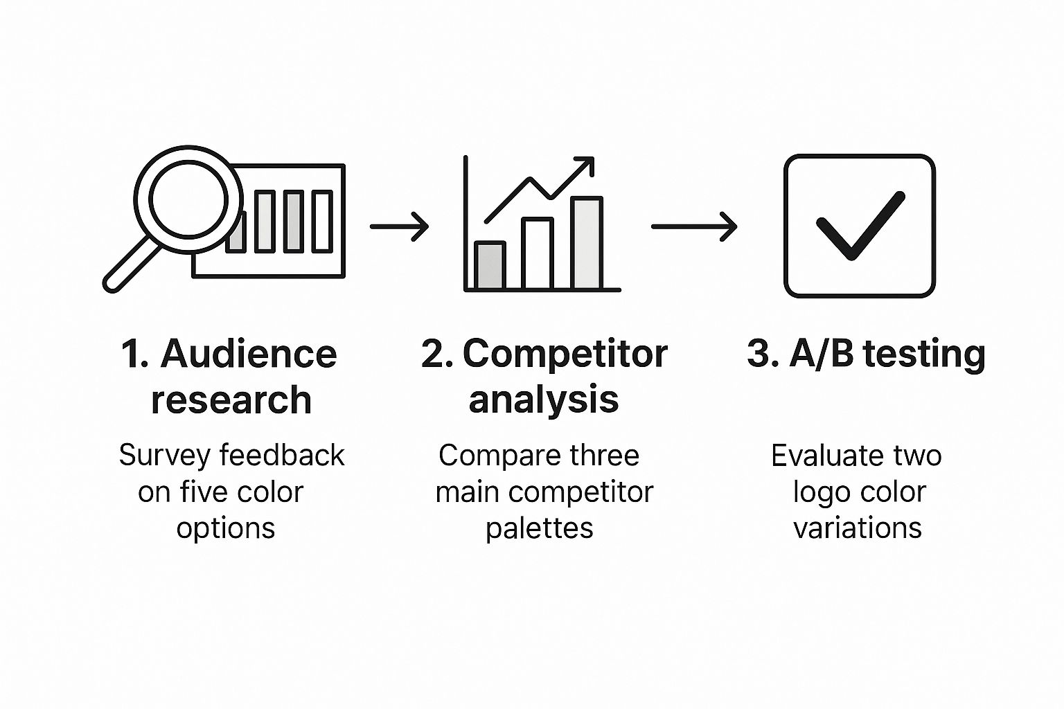
How Can I Actually Test a Color Palette?
This is a great question because your personal preference doesn't really matter here. It’s all about how your audience responds. Instead of just asking, "Do you like blue?", you need to test colors in context.
A/B Testing: This is your best friend for digital assets. Create two versions of an ad or a landing page, each with a different color scheme. Let the data tell you what works by tracking key metrics like click-through rates. The numbers don't lie.
Surveys with Mockups: Show your audience what you’re thinking. Present mockups of your website, packaging, or logo in a few different palettes. Then, ask questions tied directly to your brand goals. For example, "Which of these designs feels more trustworthy?" or "Which one seems more innovative?"
What’s the Magic Number for Brand Colors?
While there isn't one single "right" answer, there’s a sweet spot. Most strong brands stick to a palette of three to five colors. The key is to have a clear hierarchy.
A good rule of thumb is the 60-30-10 rule. It’s a classic design principle that helps create balance. Your main color should take up about 60% of the space, a secondary color 30%, and a punchy accent color the final 10%—perfect for buttons and calls-to-action.
I'm Rebranding. How Do I Introduce New Colors?
A full-blown rebrand can be tricky. If you just flip a switch overnight, you risk confusing your existing customers and losing that hard-earned brand recognition.
The best approach is a gradual one. Start by weaving the new colors into your social media posts or email marketing campaigns. This lets your audience get used to the new look and feel. Once the new palette feels more familiar, you can roll it out to bigger assets like your website and logo. And always, always explain why you're making the change. Storytelling brings your audience along for the ride.
Do Cultural Differences in Color Really Matter for Global Brands?
Absolutely. This is a non-negotiable part of color psychology in branding for any business looking to expand. A color's meaning can shift dramatically from one culture to another.
In Western countries, white often represents purity and minimalism. But in many parts of Asia, it's the color of mourning. Imagine launching a celebratory campaign using a color that your target market associates with funerals. It's a costly mistake that can seriously damage your brand's reputation. Doing your homework on cultural nuances isn't just a good idea—it's essential.
Ready to build a powerful, consistent brand identity without the guesswork? With OutBrand, you can instantly generate a 30-day social media plan that aligns perfectly with your brand's colors, voice, and goals. Transform your content strategy today at https://outbrand.design.